TSRVViewProperty is the class for TSRichViewEdit.ViewProperty property.
Unit SclRView.
Syntax
TSRVViewProperty = class(TPersistent)
Hierarchy
TObject
TPersistent
Description
Free page positioning mode
Free page positioning mode is activated in FreePosPage property. In this mode, you can define position, zooming and Z-order for specific pages.
Zooming and page arrangement
The current zooming is defined in ZoomMode and ZoomPercent properties.
In a preview mode (ViewMode=srvvmPreviewMode), clicking switches these properties between ZoomModeIN, ZoomPercentIN and ZoomModeOUT, ZoomPercentOUT.
When switching back to an editing mode (ViewMode=srvvmEditMode), they are set to ZoomModeEdit, ZoomPercentEdit.
The user can change zooming:
•using a mouse wheel, if MouseWheelZooming=True.
•using a special panel, if ZoomPanelVisible=True.
ZoomPercent can be assigned in the range ZoomMin..ZoomMax.
If zooming allows, pages may be arranged in columns, according to MaxPageColCount property.
Table icons
A table "icon" (a rectangle at the top left corner) is displayed when the user moves the mouse pointer inside a table (TRVTableItemInfo), if UseTableIcons=True.
Even when the user moves the mouse pointer outside a table, this icon is still visible for TableIconDelay.
When the user right-clicks this icon, TableIconPopupMenu is displayed. Besides, TSRichViewEdit.OnTableIconClick occurs on clicking.
The table for the displayed icon is returned by TSRichViewEdit.GetTableIconItem. A document where this table is located is returned by TSRichViewEdit.GetTableIconRVData.
Rectangle around the document area
You can display a rectangle between the document area and margins, if you set MarginsRectVisible=True. This rectangle is drawn using MarginsPen.
Hints on vertical scrolling
A hint appear on scrolling, if ShowScrollHint=True. This hint contains two lines describing the page at the scrolling position:
•HintPrefixText followed by the page number
•text from the beginning of page
This text is drawn with HintFont.
Header and footer
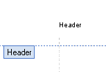
When the header is being edited, a line is shown above the main document. This line uses HeaderPen. Additionally, a label is displayed.
VCL Themes
UseVCLThemes allows using colors of the current VCL theme.

Header label
This label has text Texts.NormalPageHeader, font HeaderTitleFont, color HeaderTitleColor, border color HeaderPen.Color. If Texts.NormalPageHeader is empty, this label is not displayed.
A footers and the main document have similar properties. For the main document, a line and a label are invisible by default.
When a footer or a header is being edited, the main document can be shaded, if MainDocumentShade = True. When the main document is edited, a header and a footer can be shaded if HeaderFooterShade = True.
Page size
The page size, as it is shown on the screen, is returned in PageWidth and PageHeight properties.
They are measured in SRichViewEdit's UnitsProgram and do not depend on scaling. The same values in pixels are returned in PageWidth100Pix and PageHeight100Pix properties of SRichViewEdit.
However, these properties depend on viewing modes. If PageProperty.AutoWidth=False and PageProperty.PageViewMode=True, these properties return the same values as PageProperty's PageWidth and PageHeight. When AutoWidth or PageViewMode are changed, the screen view does not correspond to the paper size, and these properties become different.